So, long story short, I stumbled across this amazing map of Tokyo’s public transportation system by Akihiko Kusanagi about three days before the end of 2025. At the time, Claude AI had just graciously doubled its usage limits at no cost at all for 7 days, and I was on holiday with too much free time on my hands to know what to do with it.
Why not give vibe coding a try? I thought. Surely I could do something similar for Auckland. It was as if the stars had aligned above my head.
So, even when I’m somewhat against vibe coding, this was the perfect time & conditions for it to happen.
They say the Devil’s water it ain’t so sweet; you don’t have to drink right now. But you can dip your feet… Every once in a little while.
In the end, this is what came out of it: https://ptauckland3d.com
So what is it?
There were 4 things that impressed me in Kusanagi-san’s mini Tokyo project that I wanted to replicate:
- The vast network of trains
- The live update of their positions
- The live camera view of each station
- The 3D map
 It even got the snow! whaaat?
Of all the countries in the world, Japan is perhaps the one with the best train system. They have a huge network of underground and above-ground trains; from local small trains to express Shinkansen that take you from Osaka to Tokyo in 4 hours. So naturally, the first item on the list would be difficult to attain with Auckland’s smaller public transport network. But to be fair, it’s not even that small.
After building this app, I realised we had a pretty decent network for a city of 1.7 million people (compared to a whopping 14 million population of Tokyo). Still, it doesn’t mean that there aren’t things that need improving *cough*trains to airport*cough*
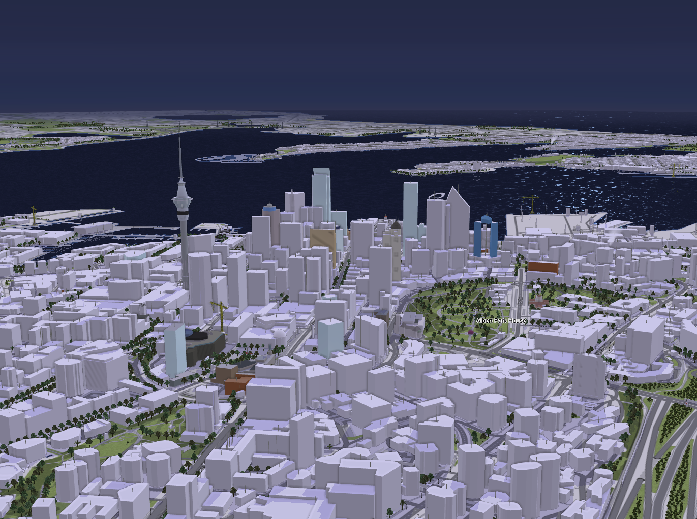
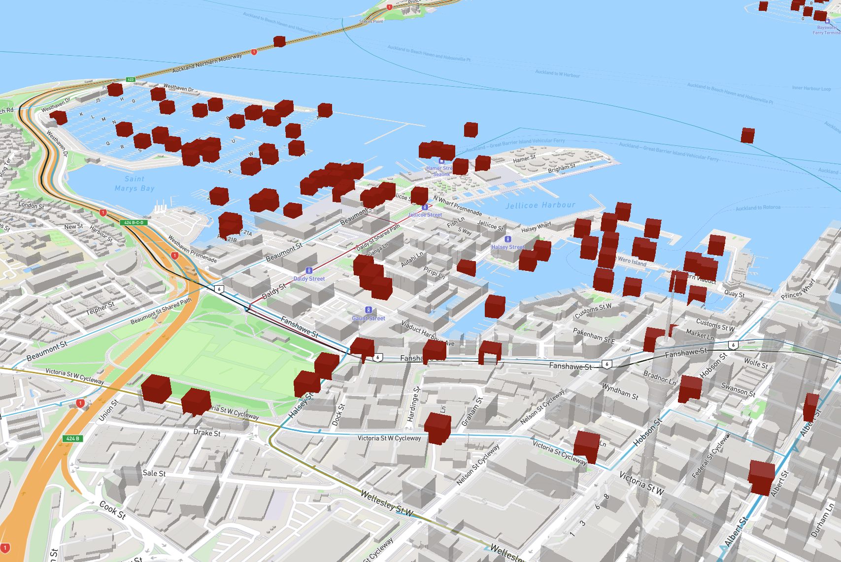
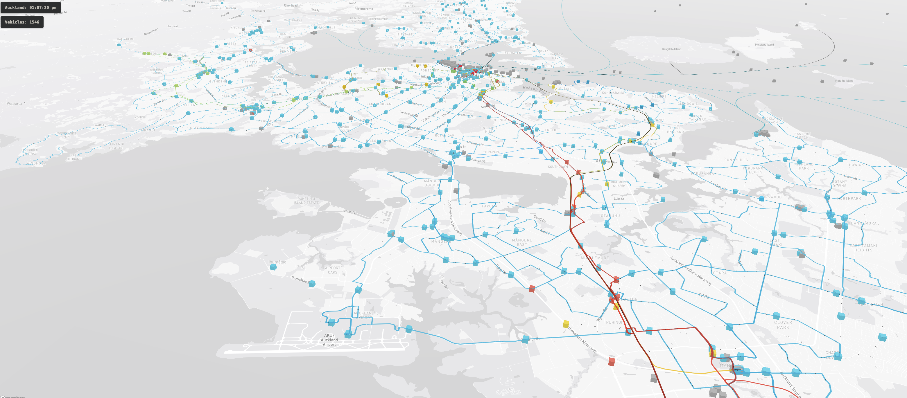
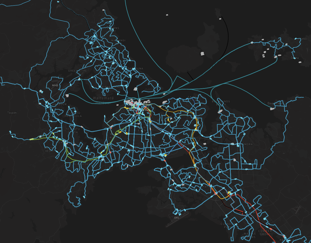 bird’s eye view of the Auckland public transport
network
bird’s eye view of the Auckland public transport
network
The second thing, about having the vehicle positions updated live on the map is pretty straightforward to implement. Since Auckland Transport publishes the locations of all buses and trains via their API at: https://dev-portal.at.govt.nz/, and the API is free (with rate limit), it’s pretty easy to grab the vehicles coordinates and plot them on a map.
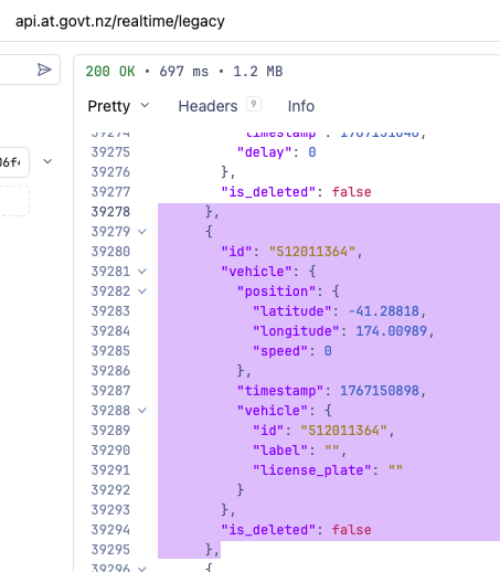
While there are no actual “live” positions, the vehicle locations are guaranteed (by AT) to be updated at least every 30 seconds, and we can request them in one single GET request. So every 10 seconds, I sent out a request for locations updates. And in that mean time, I added a sly animation of the vehicles drifting forward to gives an illusion of them moving in real-time, while we wait for the next positions update to arrive.
As for the live camera, there were no live camera feeds anywhere that I could find. The closest thing I found was NZTA camera network, which takes a single picture for each camera at a certain interval. This could be helpful in some cases, but it’s no doubt much less impressive than a live camera feed. So it’s simply not worth integrating.
My aim then reduced to: A visualisation of all the routes, buses and trains in Auckland with vehicles moving to their somewhat near real-life position.
That was enough for me to call it a win. Besides, I only got 3 days before Claude reverts to the old usage limit.
What about the 3D map?
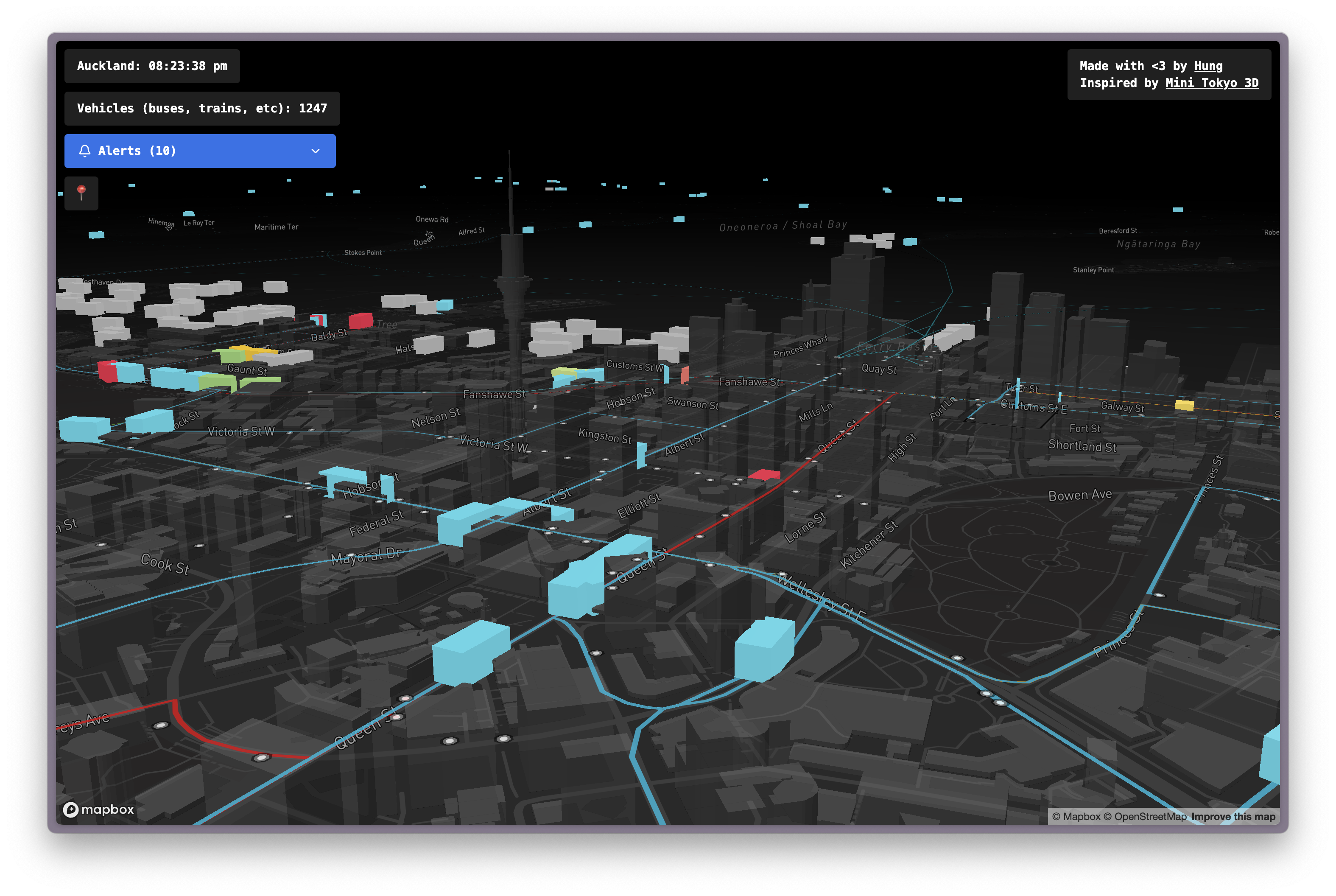
Kusanagi-san (btw this last name sounds so cool to me. I thought about Makoto Kusanagi from Ghost In the Shell when I saw this name) used Mapbox to show a 3D view of Tokyo. And luckily, the same library also works for Auckland.
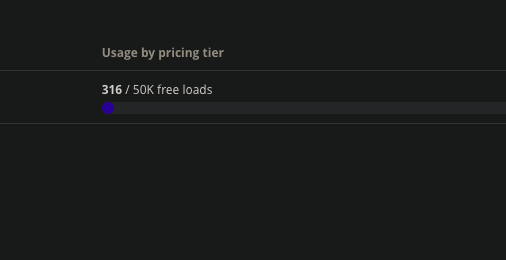
The only catch is that it offers a free limit of 50,000 loads/month. After exceeding that limit, you are automatically on pay-as-you-go. There was no option to simply disable the map when the free-tier usage is exceeded, so the chance of waking up on the curb, homeless, with a massive Mapbox bill was dangerously close to me.
But eventually, on a Sunday night, in front of the glowing monitor, I put the fate of my credit card in the hands of the people and created a free-tier Mapbox account.
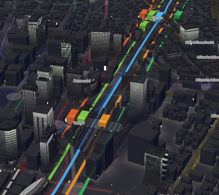
Unrelated, but during my research, I also found this impressive map with actual natural elements like trees & bushes:
 Auckland is so beautiful
How did you render the vehicles?
So you know how AT returns a list of locations for all vehicles in one single request? It looks like this:
[
  {
	"id": "512011364",
	"vehicle": {
	  "position": {
		"latitude": -41.28818,
		"longitude": 174.00989,
		"speed": 0
	  },
	  "timestamp": 1767150898,
	  "vehicle": {
		"id": "512011364",
		"label": "",
		"license_plate": ""
	  }
	},
	"is_deleted": false
  },
  ...
]
So I grabbed the latitude and longitude of these vehicles and painted them on the map as a 3D box, which Mapbox has provided an example to demonstrate how to do this with Three.js:
https://docs.mapbox.com/mapbox-gl-js/example/add-3d-model-threebox/
The result?
 An early prototype when I yet know how to colour the
vehicles:)
An early prototype when I yet know how to colour the
vehicles:)
How did you paint the route?
This one is a little more challenging. Because AT doesn’t return route data from their API but stores it in a zip file at:
https://at.govt.nz/about-us/at-data-sources/general-transit-feed-specification/.
This seemed to be the standard practice, since route data is much bigger and less likely to change. And their data follows a standard GTFS (General Transit Feed Specification) format, so there was extensive documentation on the meaning of the data:
https://gtfs.org/documentation/overview/
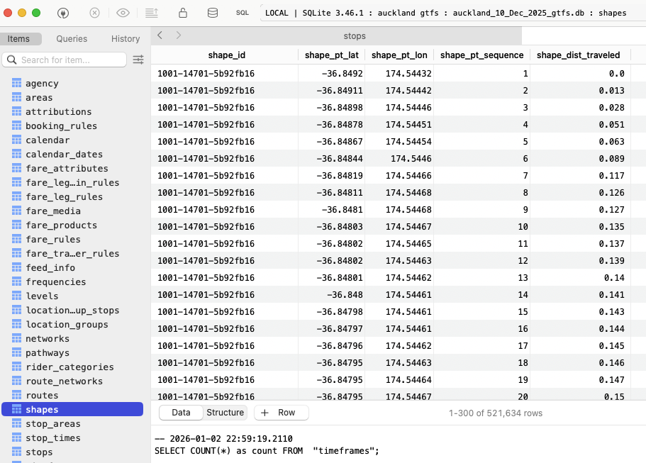
The route paths are stored in a text file called shapes.txt in the zip
archive, among other text files. These text files are essentially CSVs, and
often reference each other. In a way, these files are like tables in a database,
but without any normalisation applied. The data format was quite inefficient to
work with. So I did the obvious first step, which is to combine all these text
files into a single SQLite database for easier querying.
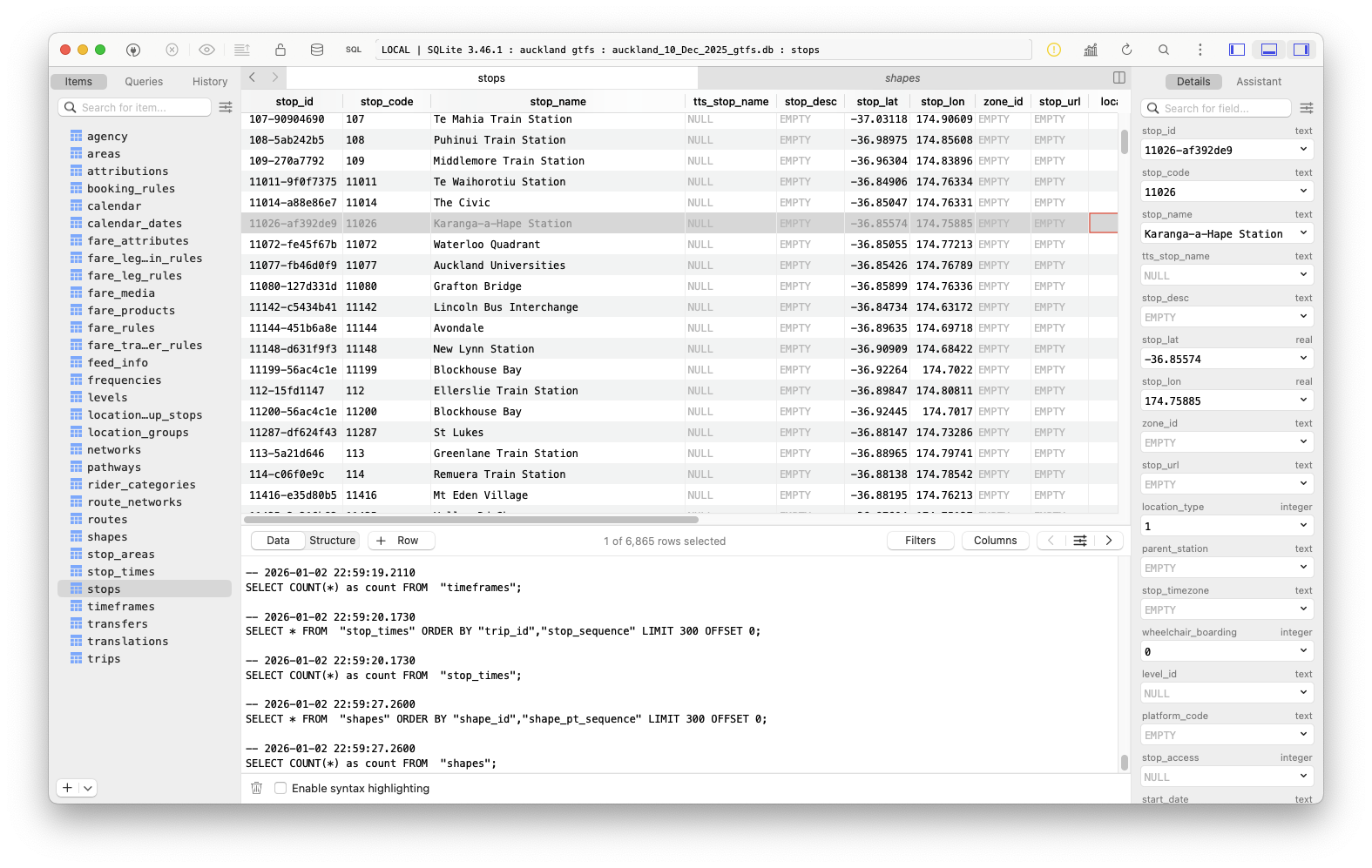
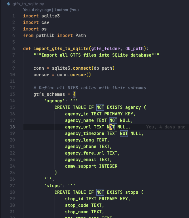
I asked Claude to write a little Python script that reads those files, parses them and generates a database file. And he did the job surprisingly well without complaint! There were a few hiccups here and there, but they were all non-obvious issues that would happen to anyone.
Then, of course, I asked Claude to write some code to query the database and paint the routes onto the map as a separate layer. And with the knowledge of the entire Mapbox API, Claude had no trouble doing that in a few seconds.
However, knowledge does not equal experience, and that is what Claude lacked. You could read thousands of books; look over millions of papers and documents on various subjects throughout the Internet, yet they could only take you so far in reality. And Claude made a mistake when deciding to render all 200+ bus, train and ferry routes in separate layers, causing the map to lag violently.
I asked Claude to consider rendering the routes in a single layer to reduce the load on Mapbox. At the time, I didn’t know if that would actually make a difference. After all, I had only known about Mapbox’s existence for a few hours. So unlike Claude, all I had was past experience and almost no knowledge. But apparently I was absolutely right!
 This could make a good wallpaper
Where did you store the SQLite database?
By the morning of the third day, I had everything running somewhat smoothly. The routes painted on the map, and the vehicle somewhat follows its path. Sometimes there are stray buses cutting through a small alley to avoid road work, or maybe the driver was just lost. But overall, everything looked like a moving, living network of public transportation. So I started to think about hosting.

The database itself was 280MB. Downloading that much data on a wired connection should take around 2-3 seconds, but considering people might be looking at the map on their phone, in the middle of nowhere, to see if their 45-minute-late bus is actually on the way, downloading 280MB could drain their mobile data, and leave them stranded without any connection to the outside world. So I decided to rethink the approach.
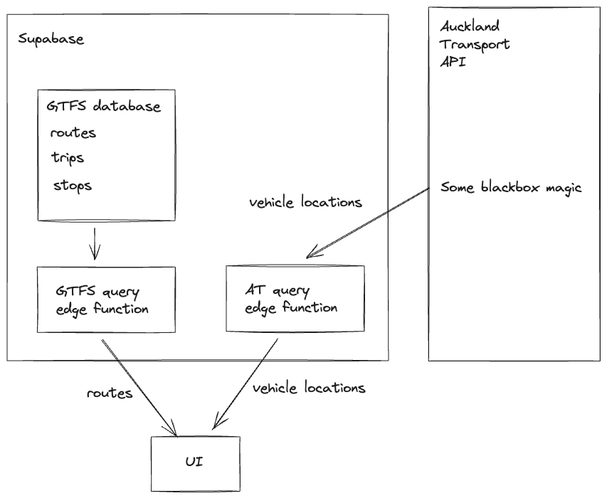
I decided to create a Supabase project. The database was within the free-tier limit, and its size never grows, so it was perfect to host the static GTFS data. Plus, I could do the querying using edge functions and have a serverless backend for the app. This reduced the bundle size, and I could even add some caching for static GTFS data.
The result is this beautiful architecture that powers the app right now:
What if I spend all day clicking refresh to use up your Mapbox usage?
Please don’t.
What are you gonna do about it?
Well, I have a mechanism that will shut down the service once the Mapbox limit is reached. So if someone abuses the app or too many people hop on it in the same month, I’d have to shut it down temporarily until the limit resets next month. Since this is a service for the community, I hope that everyone would be considerate of others.
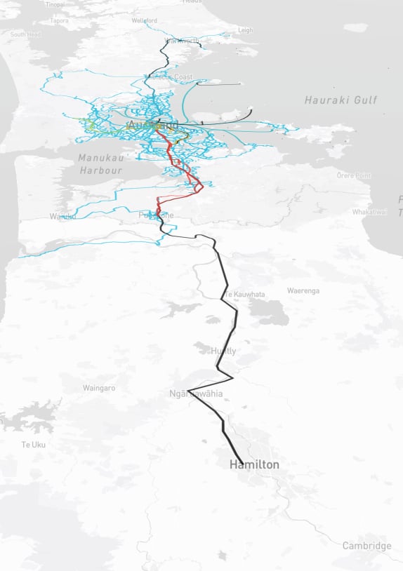
How vast is this network?
One interesting piece of information that I found after rendering all the routes on the map was that the furthest point of travel to the north of Auckland that AT covers is Wellsford. But I also spotted some unmarked vehicles out in the sea, all the way near Rangaunu Bay.
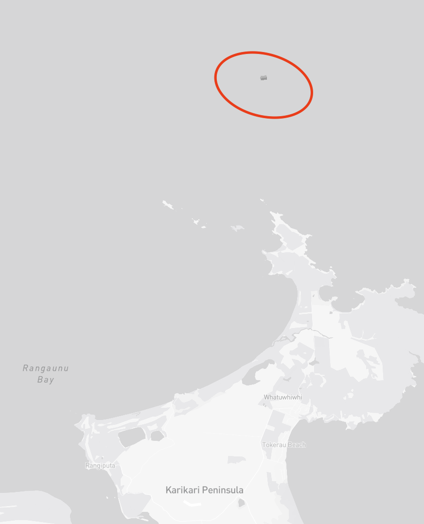
There was also a cluster of unmarked vehicles in the Bay of Islands, but I never found out what they were.
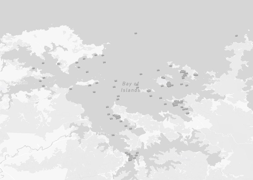
Maybe they are backup ferries? Or is AT planning to grow its network? Either way, I’m very curious.
And the farthest south you can go with your AT hop card is Hamilton. You hop on the Te Huia train at the Strand, and 2.5 hours later, moving along the Waikato River, you’d find yourself at Hamilton, dazed and confused.
How much work did you do?
Not much. The majority of the time was spent tweaking the prompt and thinking about the best way to implement certain features.
Because Claude would often use the naive approach to whatever problem you had, I had to think carefully about what kind of problem to present to Claude. I find myself thinking more about the core of my problem. Is it an actual problem? Or a symptom of something else? I would ask. Because Claude would happily sweep things under the rug while saying how absolutely right I was. It was like talking to a yes-man/woman/AI to reach a decision. In those situations, you can only rely on yourself.
In the end, I spent 40% of my time thinking, 30% typing the prompt, 10% tackling the hairy bugs that Claude was stuck on, and 20% waiting for Claude to generate the code. I almost didn’t have to write any logic myself, which is quite scary.
Did you enjoy vibe coding?
Yes and no.
I enjoy not having to type out any code myself. As a former engineer, it’s a scary thing to think about. But I have also experienced programmer’s block, so a part of me still thinks it’s kind of cool to let a machine do all the heavy lifting of the work that you know exactly how to do. But that’s also the key!—knowing exactly how to do something.
In some aspects, I think coding is manual labour, and it’s fine to let machines do it. But being creative is completely different. Being creative also consumes time, blood, sweat & tears like manual labour, but it should be a human struggle. When you write code as a creative act, I think the code should come from your own self. Because at that point, the act of coding doesn’t serve an external goal but rather to build something inside you. The satisfaction of the creative act grows on the creator’s obsession, struggles, and feeling. In my opinion, being creative is counter-productive in its nature.
But when you know exactly how the code should look, writing code can be a repetitive task, and that’s where vibe coding should come in. Like all things in life, it’s not about the tool, but about how you use it.
Having said that, we should remember pure productivity is not always the end goal. Although I can already see the world moving in that direction. Some struggles hold us back from achieving higher things faster, but they build character. And I think one should keep that in mind while doing anything related to AI & vibe-coding.
That’s boring! Any other interesting insights?
- Peak number of vehicles seemed to be 1600+.
- There’s a bus depot at Wynyard Quarter where you can see all the buses gather to sleep at night.
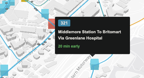
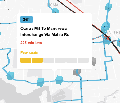
- Buses are often early or late. Rarely do you find one that’s on time. I don’t
know if this also applies to trains because they are replaced by rail buses at
the moment of writing.
 I hope this is just a mistake in
the tracking system
I hope this is just a mistake in
the tracking system - If there’s a crash or road closure, buses can be really late. But that’s why
apps like this exist—to give you more info to make a decision whether to stay
or move on.
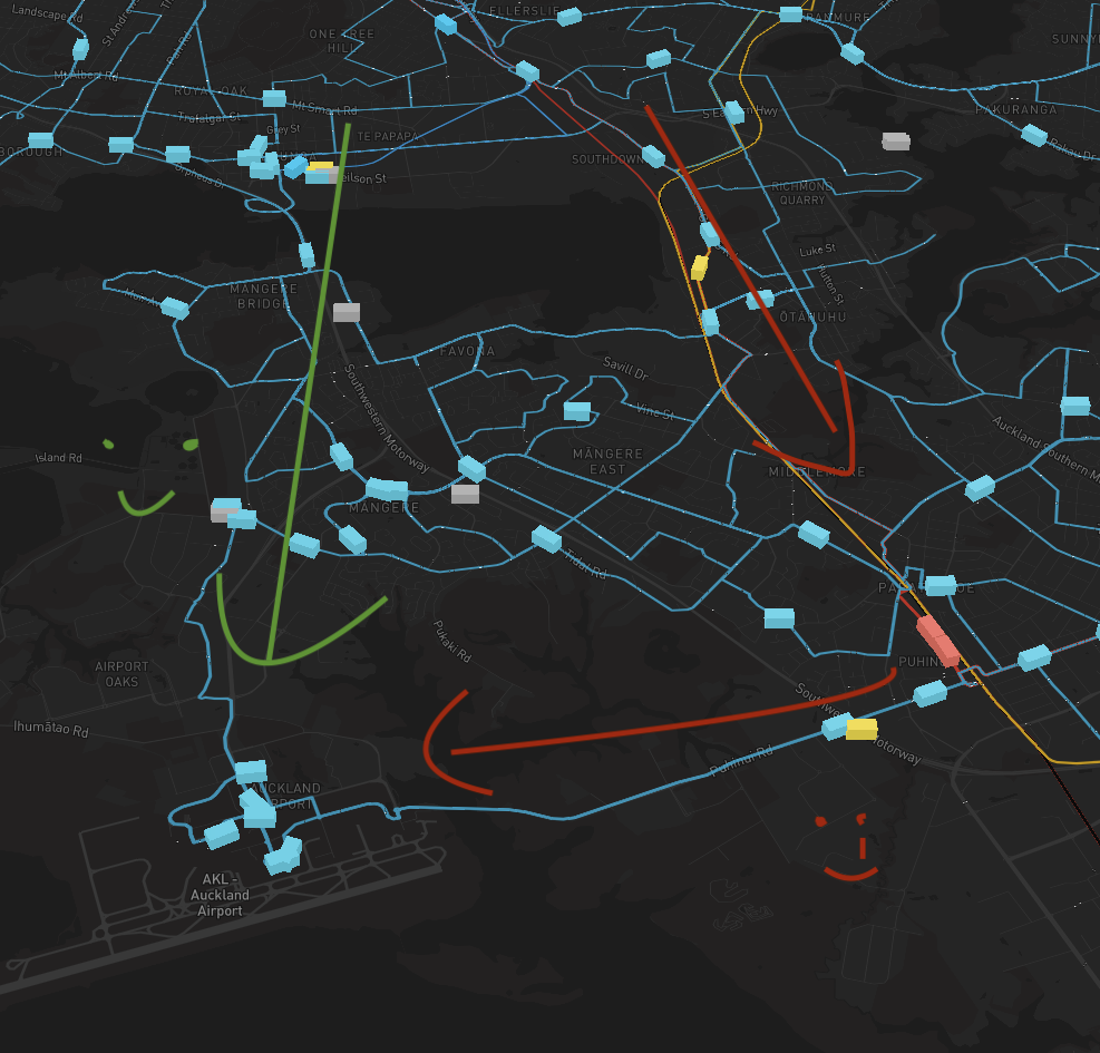
 There was a crash on 31/12/2025 & part of
Southern Motorway was closed
There was a crash on 31/12/2025 & part of
Southern Motorway was closed - The shortest path to the airport is probably through the Southwestern
Motorway. Buses are going that way, but not trains. So to get to the airport
from the CBD, you’ll have to take the train to Puhinui and transfer to the AIR
bus, which is a really tiring journey.
- Buses seemed to move pretty slowly during the day? But that’s probably a choice. At night, you can sometimes spot buses racing to North Shore for some reason (as in going very fast, not like racing with each other, although that would be kinda interesting to see).
Acknowledgement
I’d like to say thanks to the Auckland Transport dev team for letting members of the public like me gaining access to these data via the APIs. It was a great opportunity for me to give back this city & appreciate more of what Auckland Transport is doing. I can only imagine the effort that goes into coordinating these buses, trains and ferries through so many different conditions…
…and then track them, and give live updates, to millions of people, on multiple devices, every, single, day.
That’s very impressive work!
But also uhhhhhh…I think train to airport is good…should consider it…I’m paying like $50 for Uber every time I go to the airport…very sad…I’m just saying.
kthxbye.